Built on seaborn — the statistical graphics library by Michael Waskom. Grind keeps to three of its palettes: mako, flare, and deep, so the charts read as one set.
Module 01
Cumulative focus hours
A running total of every focus hour you've logged. It only ever climbs — a line that never resets, filled underneath so the slope is easy to read at a glance.
daily = df.groupby("date")["duration"].sum() / 60
total = daily.cumsum()

sns.lineplot(x=total.index, y=total.values,
             color=sns.color_palette("crest")[5])
plt.fill_between(total.index, total.values, alpha=0.22)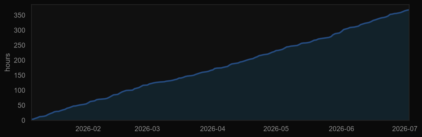
Module 02
Focus by hour × weekday
A heatmap of when you actually work. Rows are the days of the week, columns are the hours of the day, and the brighter a cell, the more minutes you spent focused in that slot.
pivot = df.pivot_table(index="weekday", columns="hour",
                       values="duration", aggfunc="sum")

sns.heatmap(pivot, cmap="mako", cbar=False,
            linewidths=1.2, linecolor="#0A0A0A")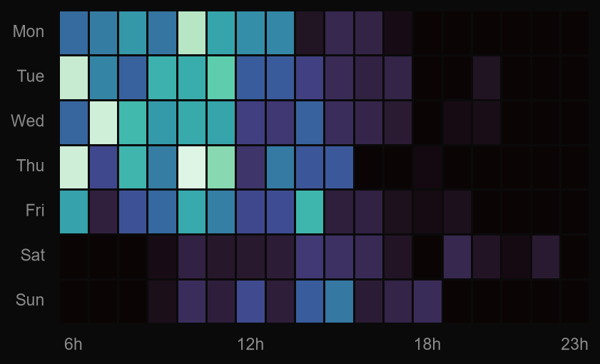
Module 03
Session length by project
A boxplot, one row per project. The box holds the middle half of your sessions, the line inside is the median, and the dots are the outliers — the marathons and the false starts.
sns.boxplot(data=df, y="project", x="duration",
            hue="project", palette="flare", legend=False)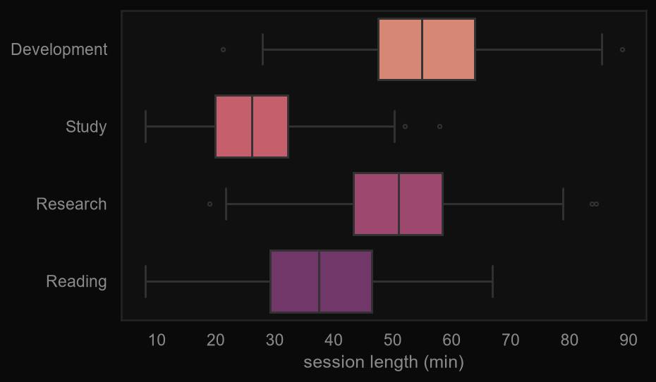
Module 04
Start hour vs length
Each dot is a single session: when you started it on the x-axis, how long it ran on the y. Colour tells you which project — so you can see, say, that your long sessions all begin before noon.
sns.scatterplot(data=df, x="hour", y="duration",
                hue="project", palette="deep", s=34)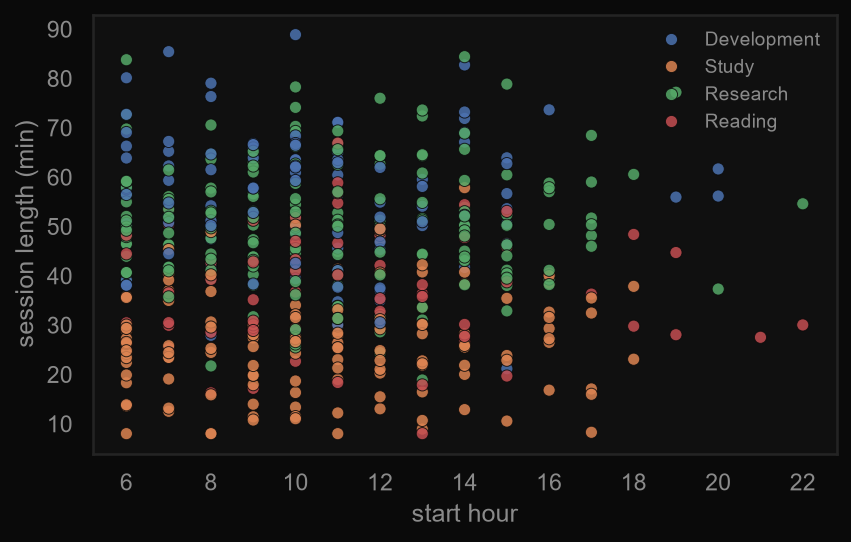
Module 05
Focus density
The same two axes as the scatter, but drawn as a bivariate density — contour lines, like a topographic map, that pool where your sessions cluster. It shows your habits even when the dots overlap.
sns.kdeplot(data=df, x="hour", y="duration",
            cmap="mako", fill=True, thresh=0.05, levels=10)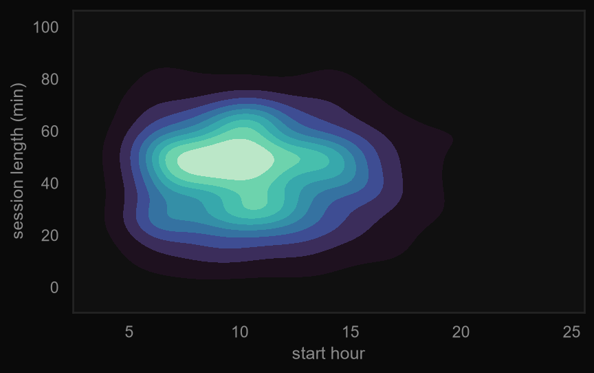
Module 06
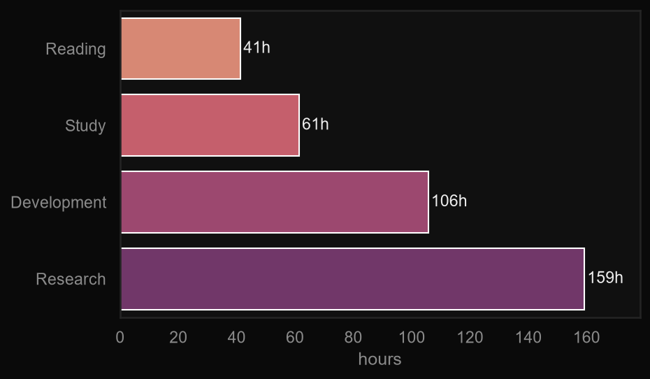
Time by project
The simplest one, and often the one you check first: total hours per project, as horizontal bars, longest at the bottom. It keeps counting even for projects you later archive.
totals = df.groupby("project")["duration"].sum() / 60

sns.barplot(x=totals.values, y=totals.index,
            hue=totals.index, palette="flare", legend=False)